
Bridging the Talent Gap: Designing a Platform Where Global Recruiters Meet Top Talent
Project Overview
- Product Type: Web & Mobile
- Platform Role: Product Design Lead
- Timeline: 6 Months
- Team: 1 Product Manager, 5 Developers, 1 Data Analyst, and Myself
- Tools: Figma, FigJam, Maze, Illustrator
Summary
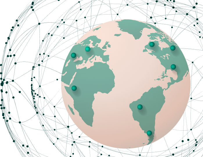
The Global Talent Cloud is a recruitment platform designed to connect employers and verified professionals across global markets. The vision was to create an experience that blends the precision of data-driven hiring with the warmth of human connection enabling recruiters to source talent efficiently while helping professionals present their value with clarity and confidence.
The Challenge
Recruiters often juggle multiple tools for candidate sourcing, vetting, and communication resulting in time loss, inefficiency, and inconsistent hiring experiences. Meanwhile, professionals struggle with fragmented platforms that fail to represent their true skill sets or match them effectively with the right roles.
We needed to design a unified, scalable platform that:
- - Simplifies global hiring for recruiters
- - Empowers talents to stand out authentically
- - Works seamlessly across web and mobile interfaces
Project Goals
- - Create a human-centered recruitment experience that minimizes friction in finding and hiring talent.
- - Design a dual-interface system (for recruiters and talent) that feels balanced and consistent across devices.
- - Build a design system that ensures scalability and brand cohesion.
- - Drive measurable improvements in user engagement and efficiency.
My Role and Responsibilities
As Product Design Lead, I was responsible for:
- - Leading end-to-end design for both mobile and web applications.
- - Conducting stakeholder interviews and user research across two user groups (recruiters and talent).
- - Mapping key user journeys and defining feature priorities.
- - Designing the UI/UX architecture and visual system.
- - Overseeing prototype testing, feedback loops, and developer handoff.
I collaborated closely with the Product Manager to align design goals with business strategy and ensure that each feature delivered measurable user and business value.
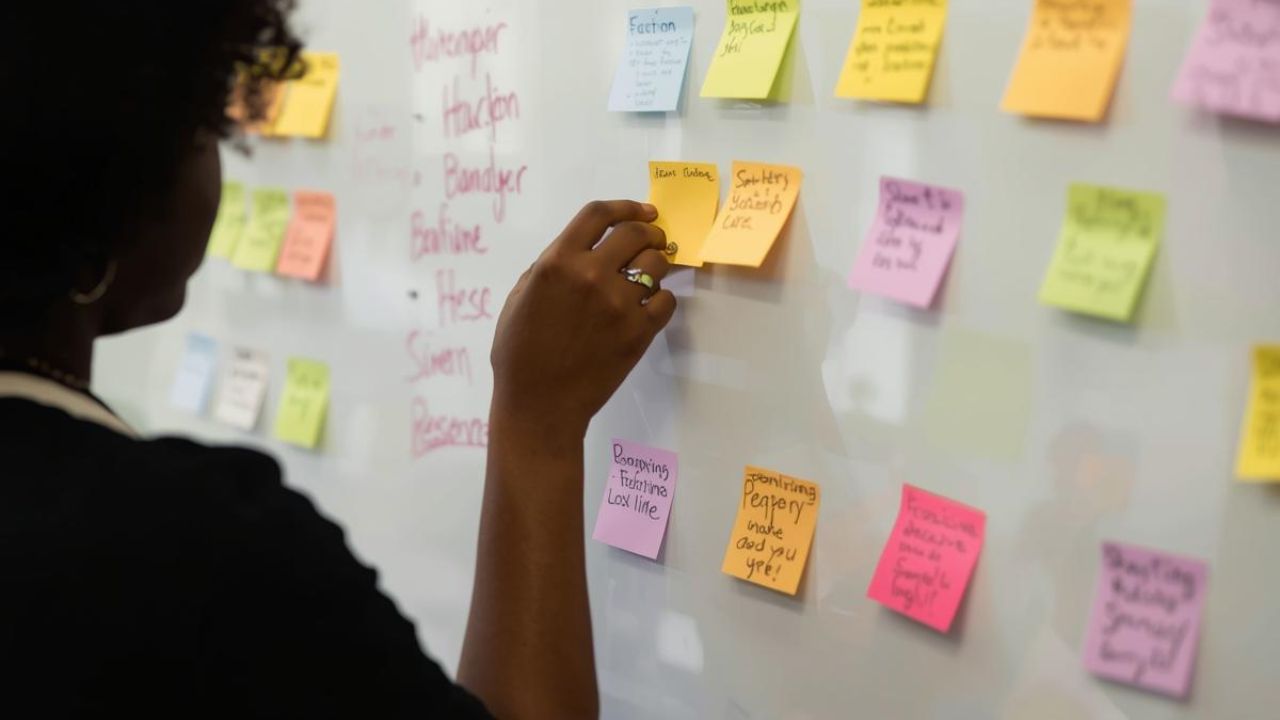
Design Process
Research and Discovery
To ground the product in real user needs, I conducted a mix of qualitative and quantitative research:
- - 10 recruiter interviews across tech, finance, and creative industries.
- - 8 professional interviews (mid-level to senior roles).
- - Competitor analysis of platforms like LinkedIn, Wellfound, and Deel.
Key Insights:
- - Recruiters prioritize speed, relevance, and credibility in talent discovery.
- - Professionals value visibility, transparency, and humanized matching.
- - Both groups feel existing platforms lack context and trust-building features.
These findings shaped our initial hypotheses and guided the design strategy: streamline, clarify, and connect.
Defining Core Experiences
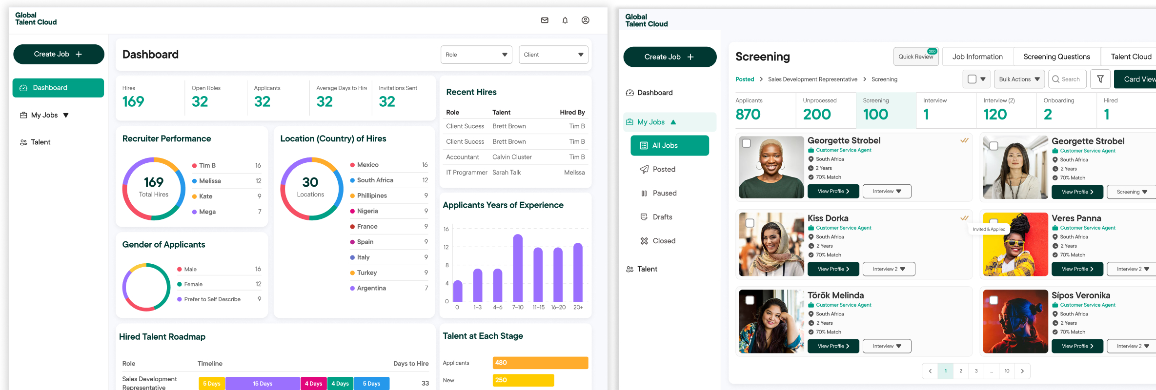
From the insights, I mapped two parallel user journeys:
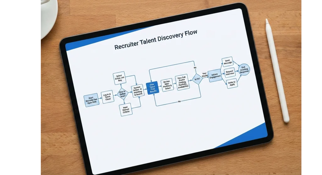
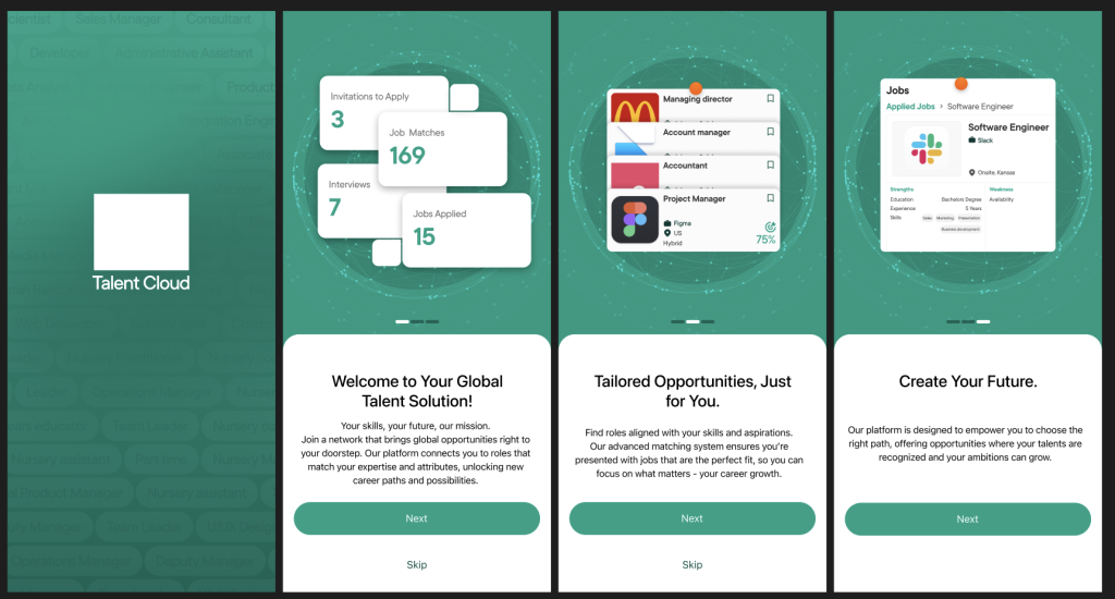
Each flow was designed to minimize steps and provide immediate value. Recruiters could filter candidates with AI-powered recommendations, while talents received real-time visibility into their match strength and opportunities.
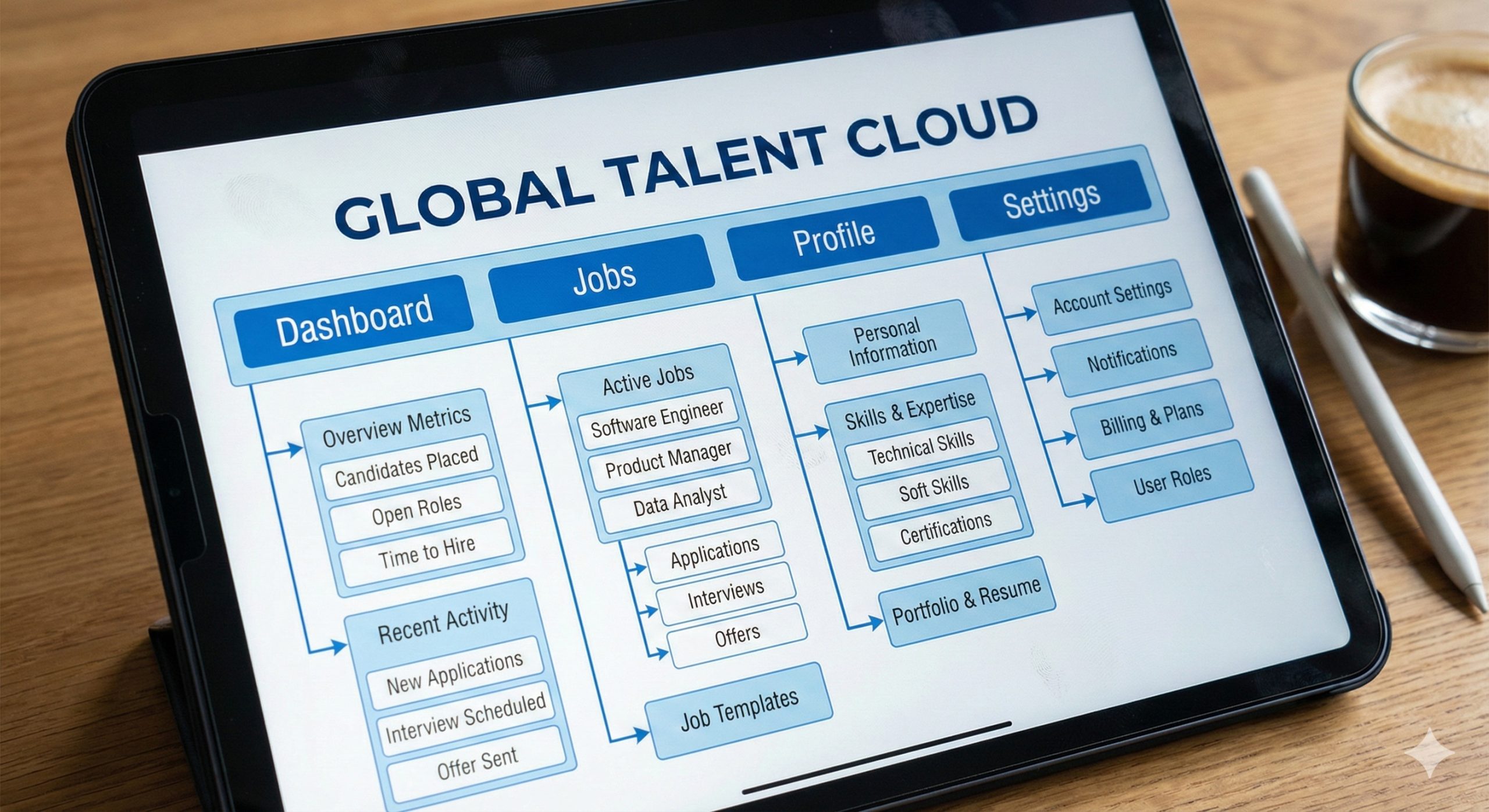
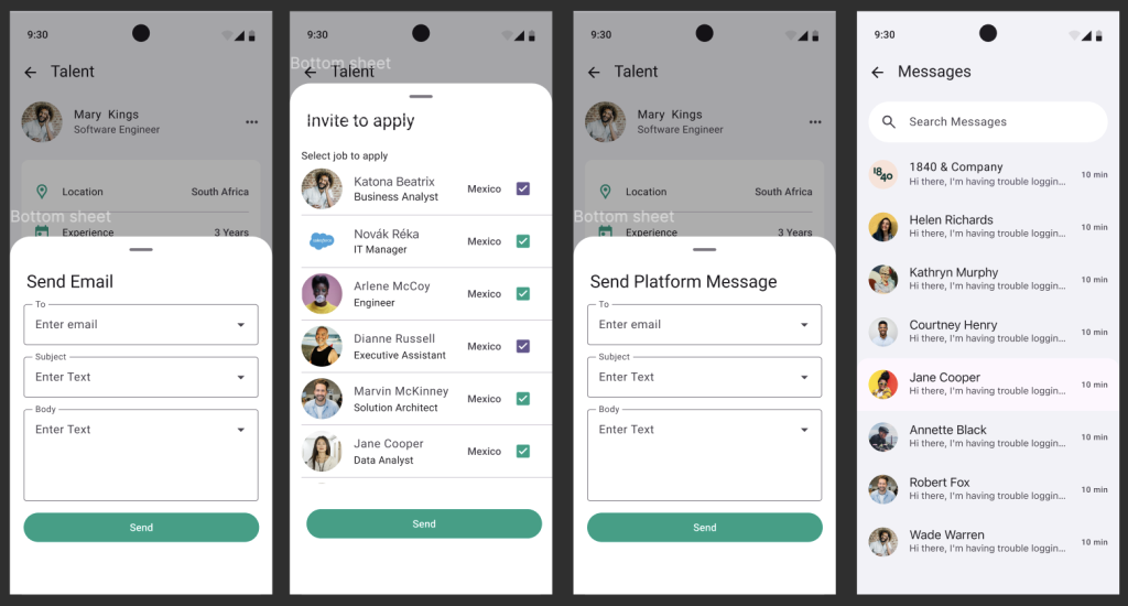
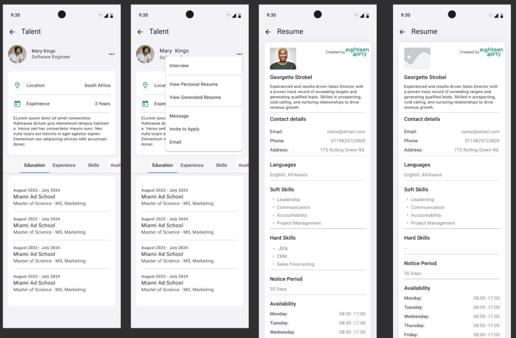
Information Architecture and Wireframes
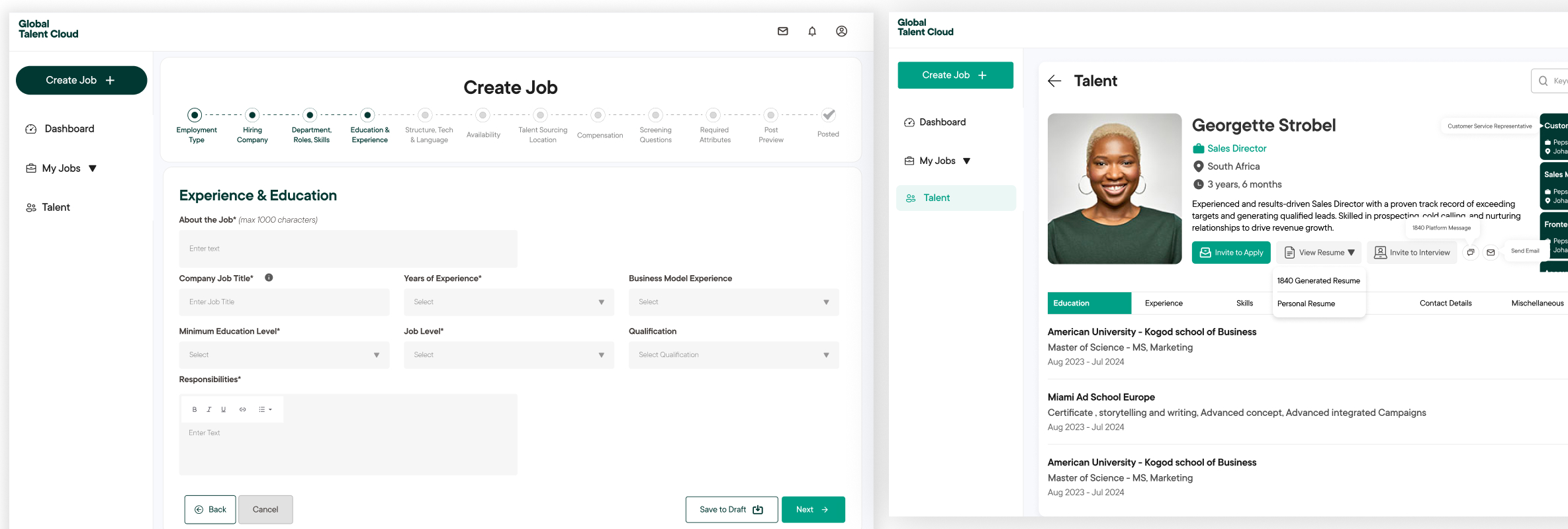
I developed the IA and low-fidelity wireframes to test navigation and interaction logic early. The design emphasized clarity and speed — recruiters could access candidate insights within three clicks, while professionals had guided onboarding to complete rich profiles.
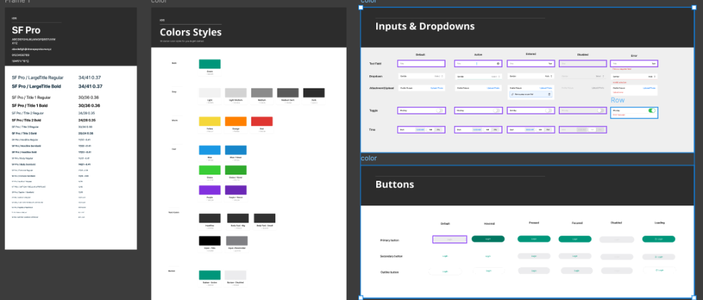
Visual and Interaction Design
The interface system was built around three principles: clarity, inclusivity, and consistency.
- - Typography: Modern and legible, balancing professionalism and approachability.
- - Color System: Blue and teal tones for trust, complemented by neutral backgrounds.
- - Interaction: Subtle animations and micro-interactions to reinforce responsiveness.
- - Accessibility: WCAG-compliant contrast, large touch zones for mobile, and keyboard navigation support for web.
For mobile, I designed a modular bottom navigation with context-aware actions — making talent engagement and recruiter communication intuitive and quick.
Prototype Testing
I developed interactive prototypes and conducted two rounds of user testing using Maze.
- - Round 1: Navigation & usability feedback
- - Round 2: Feature clarity and interaction validation
Key Outcomes
- - Recruiters completed candidate searches 40% faster than baseline benchmarks.
- - Talents reported higher satisfaction with profile onboarding and visibility feedback loops.
The Outcome
The final product delivered a cohesive, intuitive experience across web and mobile:
- - Unified platform: Streamlined global hiring from search to connection.
- - Optimized workflows: Reduced recruiter friction and improved candidate discovery efficiency.
- - Design system: Established scalable, reusable UI components for future development.
Impact
- - 40% faster recruiter search completion time
- - 30% increase in candidate engagement during onboarding
- - Consistent design adoption across web and mobile
- - Positive feedback from beta testers for simplicity and global appeal
Reflection
This project underscored the importance of designing for both user groups with equal empathy creating a balanced ecosystem where recruiters and talents both feel supported. It also deepened my understanding of scalable systems thinking, especially in cross-platform experiences where visual and interaction consistency drives trust.
Building for both web and mobile simultaneously required precise collaboration, flexible design tokens, and a strong design system mindset lessons I continue to apply in subsequent projects.
Closing Note
The Global Talent Cloud represents more than a hiring tool — it’s a rethinking of how global opportunities are formed. Designing it reaffirmed my belief that when technology feels human, connections become meaningful.